Color Closeup- Our Blues
Posted: 06-13-2014 03:00 PM
Views: 2824
Synopsis: In our third of 12 color closeups, we examine our blue shades! Wondering how they look in person? Wonder no longer! Just read this blog!
|
We got a lot of great feedback about our color blogs so far! This post is going to be all about our blue shades! This group is, oddly enough, a hard color group to find an “everyday item” for. The objects we decided to use for comparison are an average recycling bin and my manager’s 2010 Atomic Blue Honda Civic. If you’re wondering what color blue that is, I like to refer to it as “Prius Blue”. Let’s be honest,, you see these cars everywhere. In fact, you probably got cut off in traffic by one on your way home from work yesterday- and it could've been my manager! All jokes aside, here is the comparison using the recycling bin below.
The comparison with the Atomic Blue Honda Civic…
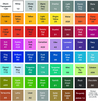
It's worth mentioning that variations between my interpretation of the colors and the way you perceive them are often prominently due to different screen resolutions. In this comparison, an element that definitely got in our way was the lighting. For example, Powder Blue #172 appears to be an off-white color with a blue tint when out in the sun, but when indoors, is perceived as a light, almost gray, blue. With that being said, my main goal is to convey exactly how the blues vary from each other and focus on how tricky they can be on our color chart. I will begin by saying that Navy #50 is our darkest blue shade and Powder Blue #172 is our lightest blue shade. The colors go down from darkest to lightest as shown in the photos but there are a few key colors to pay attention to. Brilliant Blue #86 is a very tricky blue. This guy has a bit of a violet tint but it's still a bright, yet dark blue color, making it truly “brilliant”! Muted Blue #57 and Dusk Blue #51 are often confused as being the same color, but Dusk Blue #51 is just a little bit darker. The last blue that always tricks people in our previews is Geyser Blue #173. Although it is hard to tell, if you look closely at the recycling bin photos, Geyser Blue #173 is actually a little brighter than Ice Blue #56. This color really “pops” when compared to the neighboring blues. I hope this helped you in your quest to find the perfect shade of blue. If you want to order color samples so that you can see them in person, order them here: http://www.beautifulwalldecals.com/color-sample-card.html . You also can get a working sample on that form. You get a $5.00 gift certificate just for ordering color samples from us, so it’s win-win! Just so you know, Beautiful Wall Decals always offers free shipping. A free practice design and installation tool is also included with every order! Don’t forget that our customer service staff are available via e-mail (info@beautifulwalldecals.com) to help you out with your trickiest decal problems! Remember… your walls should make you smile! |


